© 2012-2025 Brick Visual Solutions Zrt. All Rights Reserved. Privacy Policy

Blog
The Language of Leading Lines
Exploring the most powerful composition tool in archviz
Discover how leading lines in archviz can draw the eyes toward the building and create the best narrative. The article is illustrated with many architectural photographs and visualizations that help you understand the topic better.
Overview
When asked about leading lines, our Chief Creative Director, Márton Zoltán Tóth, explains that they are a compositional rule that may seem easy to understand in theory, but can be challenging to follow in practice. Essentially, these are lines within the image that guide the viewer's gaze toward a specific point of focus. To truly master this technique, you must have a deep understanding of its nuances and do research on how it can be effectively used. Due to its complexity, we decided to go over all of them with examples, both from architectural photography and Brick projects.
Leading Lines in Architecture
Leading lines are important in architectural photography because they help to create a sense of depth and dimensionality in the image. By drawing the viewer's eye toward the main subject, they can help to create a more engaging and dynamic composition. They are also useful for emphasizing the unique features and details of the building while highlighting its character.
These lines can be found in the architectural elements themselves, such as the lines of a building's facade, corridor, row of columns or the curve of a staircase. Spotting and showcasing these features artfully can help create a sense of movement or direction in the photo, resulting in a visually striking image.
There are several types of leading lines in architecture to remember, as they each convey different moods and emotions in the photo — from grandeur and stability to movement and elegance. Let’s have a look at the most common types with examples!
1. Vertical Lines
As the name suggests, they run vertically across the image, drawing the viewer's eye upwards toward the sky or the top of the building. These lines are great when aiming to communicate the height and grandeur of the structure. Look at the vertical lines of a skyscraper, tall column, window, door or elevator shaft to get this effect.

2. Horizontal Lines
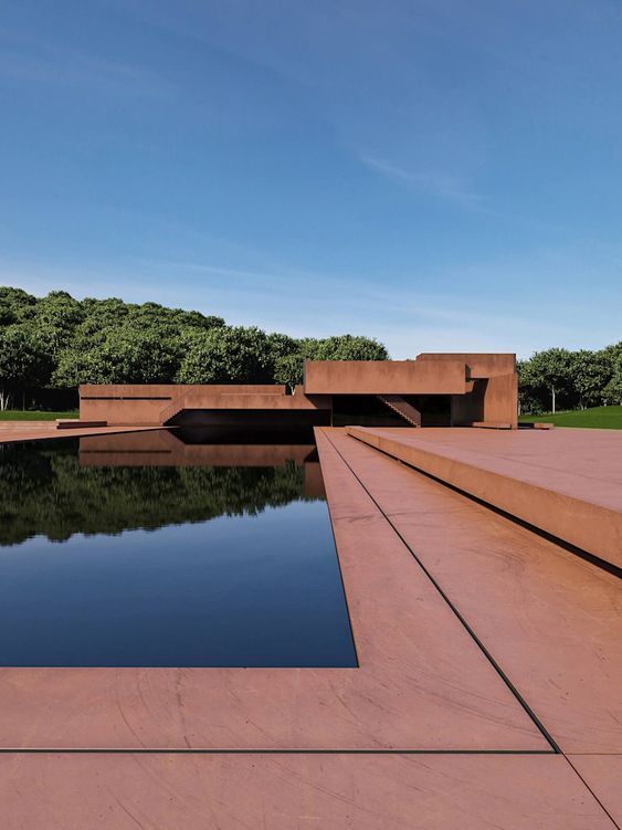
These are straight, level lines that run parallel to the ground. They are often used when the goal is to express the width of the building, or to create a sense of stability, balance and order in the image. A long hallway or row of windows can help you get that feel.

3. Diagonal Lines
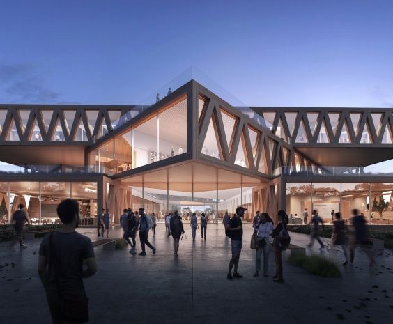
These lines run at an angle to the horizon, creating a dynamic and energetic feeling in the image. They can add a sense of movement, direction, and drama to the composition, and are often used to convey a sense of tension or excitement. Search for these lines when looking at staircases, roofs, eaves, and bridges with angled support.

4. Curved Lines
These lines have a gradual curve or arc. Although less common in architectural photography, they can create a sense of fluidity, grace, and elegance in the image. Arches, domes, curved walls, and sculptures or other decorative elements with curved lines are excellent to use when aiming for the soft mood created by curved lines.

Using Leading Lines in Architectural Visualization
Using leading lines in architectural visualization requires careful consideration of the building's design and the composition of the image. Here are some tips for using them effectively in your work.
1. Look for lines in the building's design
As we’ve seen above, leading lines can be found in many architectural elements. Look for these elements and use them to create a sense of direction and movement in the image.

2. Consider the angle and perspective
The angle and perspective of the image can have a significant impact on the effectiveness of the leading lines. Experiment with different variations to find the most effective use of the leading lines.
3. Use the lines to frame the subject
Leading lines can be used to frame the main subject of the image and draw the viewer's eye toward it. Consider the placement of the lines to create a sense of depth and dimensionality in the image.

4. Use leading lines to create a narrative
By using leading lines strategically, you can also build a narrative within the image. For example, a diagonal line leading to a door can create a sense of movement toward the building's entrance.

5. Pay attention to the composition
Leading lines can be used in conjunction with other compositional techniques, such as the rule of thirds or symmetry, to create a more complex and emotionally resonant image.

Examples of Leading Lines in Architectural Visualization
Architectural photography and archviz are related in the sense that they are both used to showcase and highlight the design of buildings. So similar compositional rules can be followed to create a striking image. But in archviz, you have more freedom to arrange elements and highlight features to your liking. We’ll show you some Brick projects that reflect the rule of leading lines nicely:
- A diagonal line created by the stair railing leads toward the top of the building.

- The vertical lines of the facade lead toward the building's entrance.

- The horizontal lines of the facade express the width of the building.

- The curved lines of an arch lead toward the main subject of the image.

- The diagonal lines of a roofline lead towards the building's peak.

We hope you found this guide useful!