© 2012-2024 Brick Visual Solutions Zrt. All Rights Reserved. Privacy Policy

Blog
Stunning Archviz Portfolios
Practical tips for a standout design
We have collected the dos and don'ts for creating the best archviz portfolio that will help you land a job in the industry.
Overview
As an archviz artist, your aim is to develop the best visualization to get the next big commission or career-enhancing job. When submitting your portfolio to potential clients and employers, you think your images will speak for themselves. But did you know your portfolio’s layout, typography and style are as important to determine your artistic ability?
András Káldos, Brick’s CEO has screened thousands of archviz portfolios in the past 10 years. While some artists surely stood out in terms of overall quality, many of them failed to present their work in a convincing way. To help you reflect your talents, we have collected the dos and don'ts for creating a perfect portfolio you can send to any archviz studio of your choice. Tips applicable to artists of all levels, junior and senior alike!
1. Purpose
DO
A portfolio is a consciously designed document, where not only the quality of visualizations matters but the way you present them. The first question you should ask yourself is: who am I going to send it to? Let’s say, if your goal is to get employed by an archviz studio specializing in real estate projects, you should focus on showing residential projects and interiors. At Brick, we receive commissions mostly for public buildings and exteriors, so we recommend keeping that focus if you want to work here. The point is, always review the profile of the company or client and create specific portfolios for them.
DON’T
Having said that, the ‘one-size-fits-all’ approach won’t do here. If your standardized portfolio lacks the profile your target employer has, they might simply think you wouldn’t be a good fit for the position. Another thing: don’t send archviz studios your architecture portfolio (eg. architecture plans or concept sketches), because that’s not what archviz studios are looking for. Even if you only have a couple of images that seem relevant to your dream employer, include those and target a more entry-level position. That way, you will have better chances of being called back.
Another thing. Do not send links to your Behance/Instagram page, saying that’s your portfolio. It shows you put 0 effort into presenting yourself, demotivating the reviewer to proceed with your submission.
2. Structure + overall design
DO
In terms of structure, we advise following this logic:
- Cover
- CV (+ optional Bio)
- Works (commissioned or/and non-commissioned)
- Photos, paintings, artwork of any medium (optional)
- End Page
Since all of these elements are included in the same portfolio, you should create a unified, simple style. A more minimalistic approach will tie these elements together nicely. Make sure that all pages are of the same size and format - if you started using landscape format, stick to that throughout your portfolio. You can of course go with portrait format or square too if you see that better matches your vision of the design.
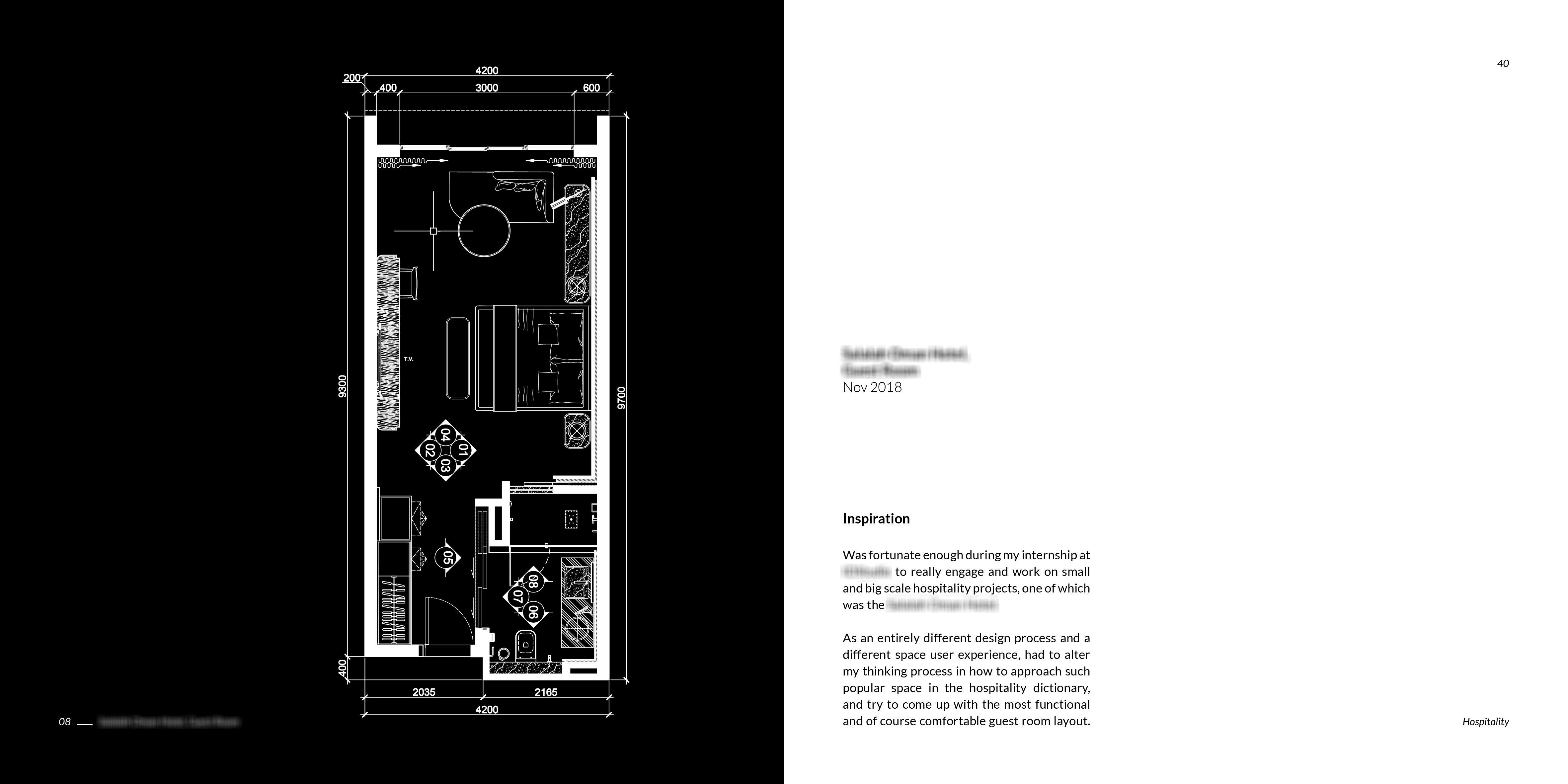
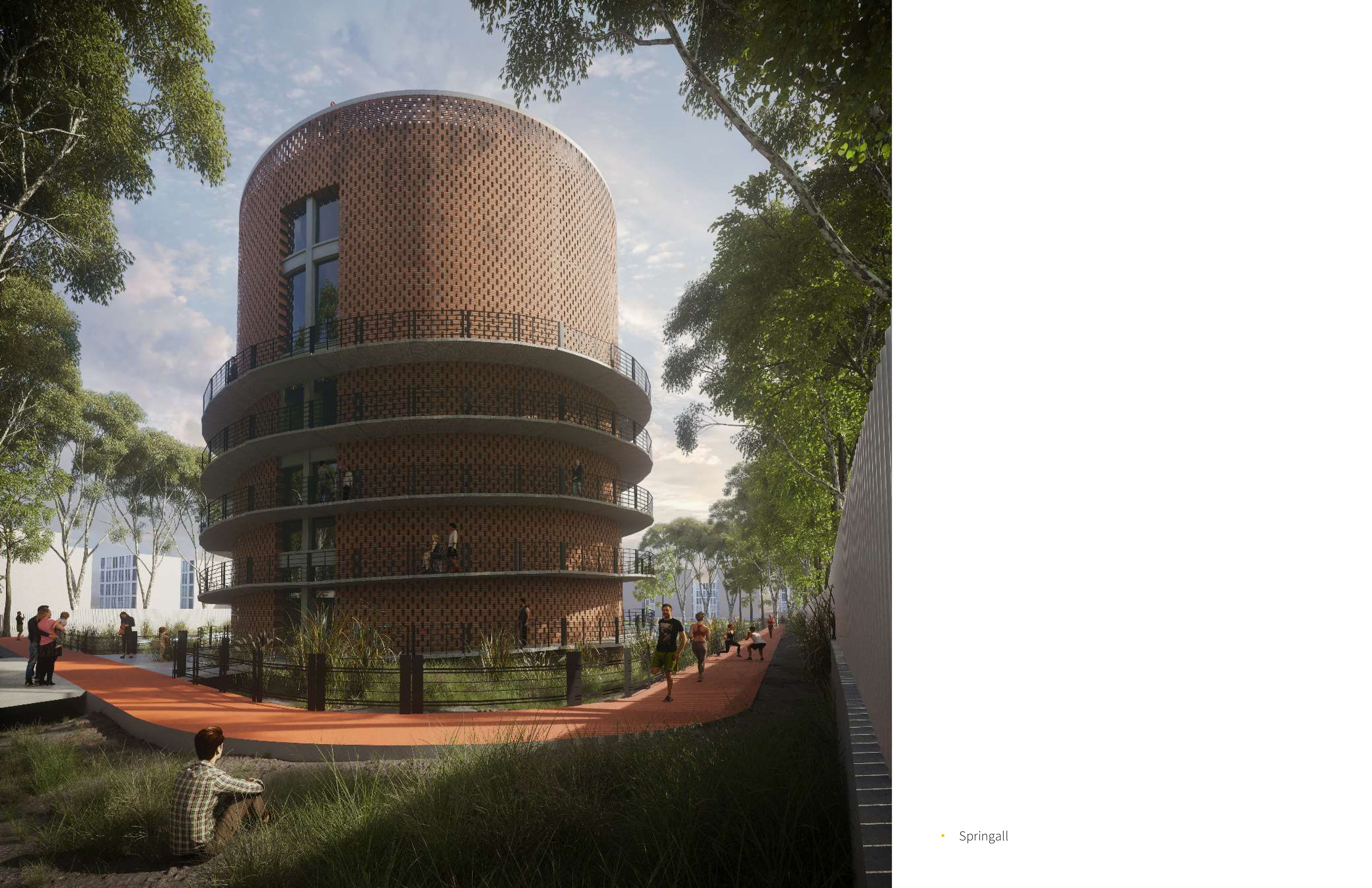
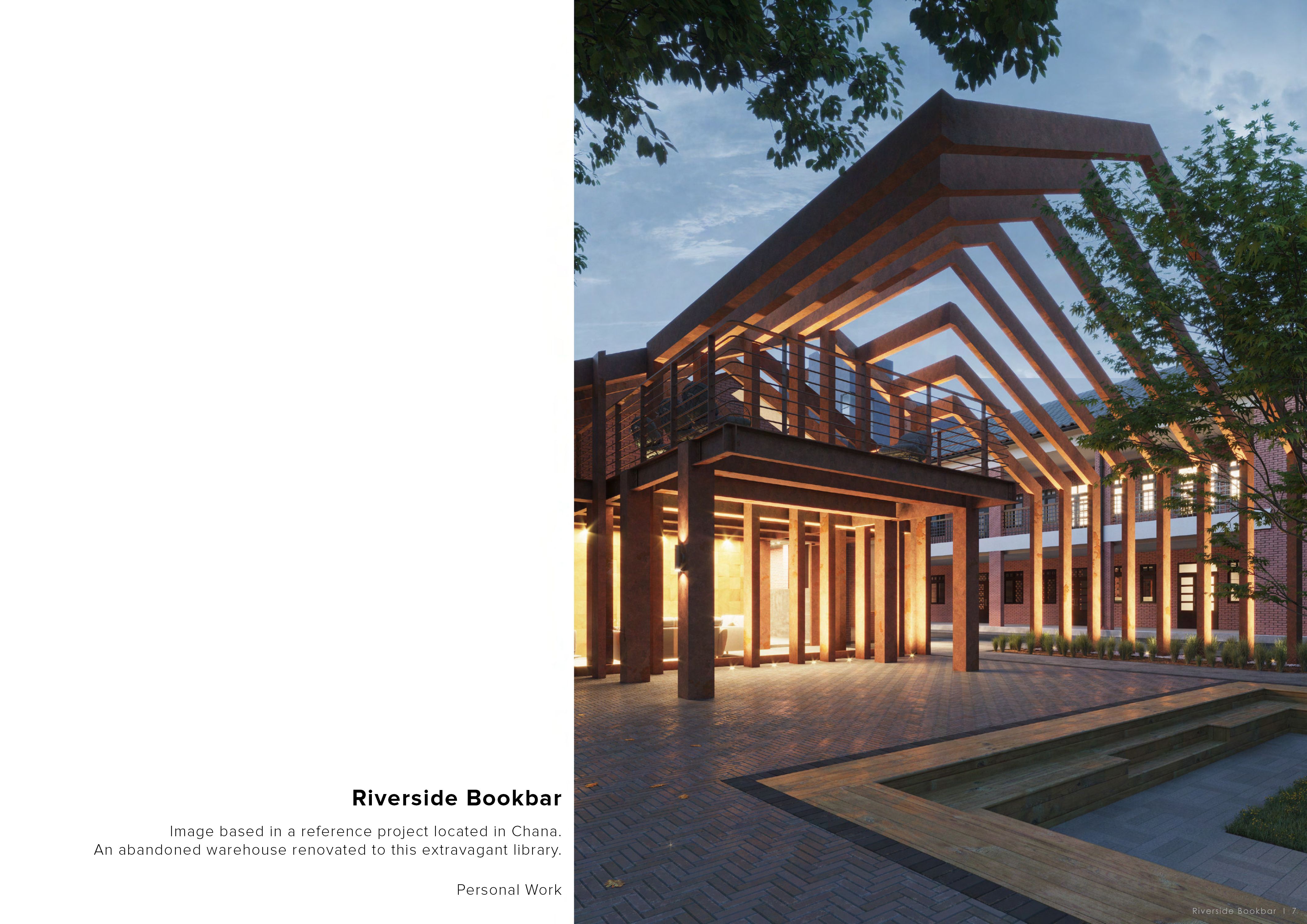
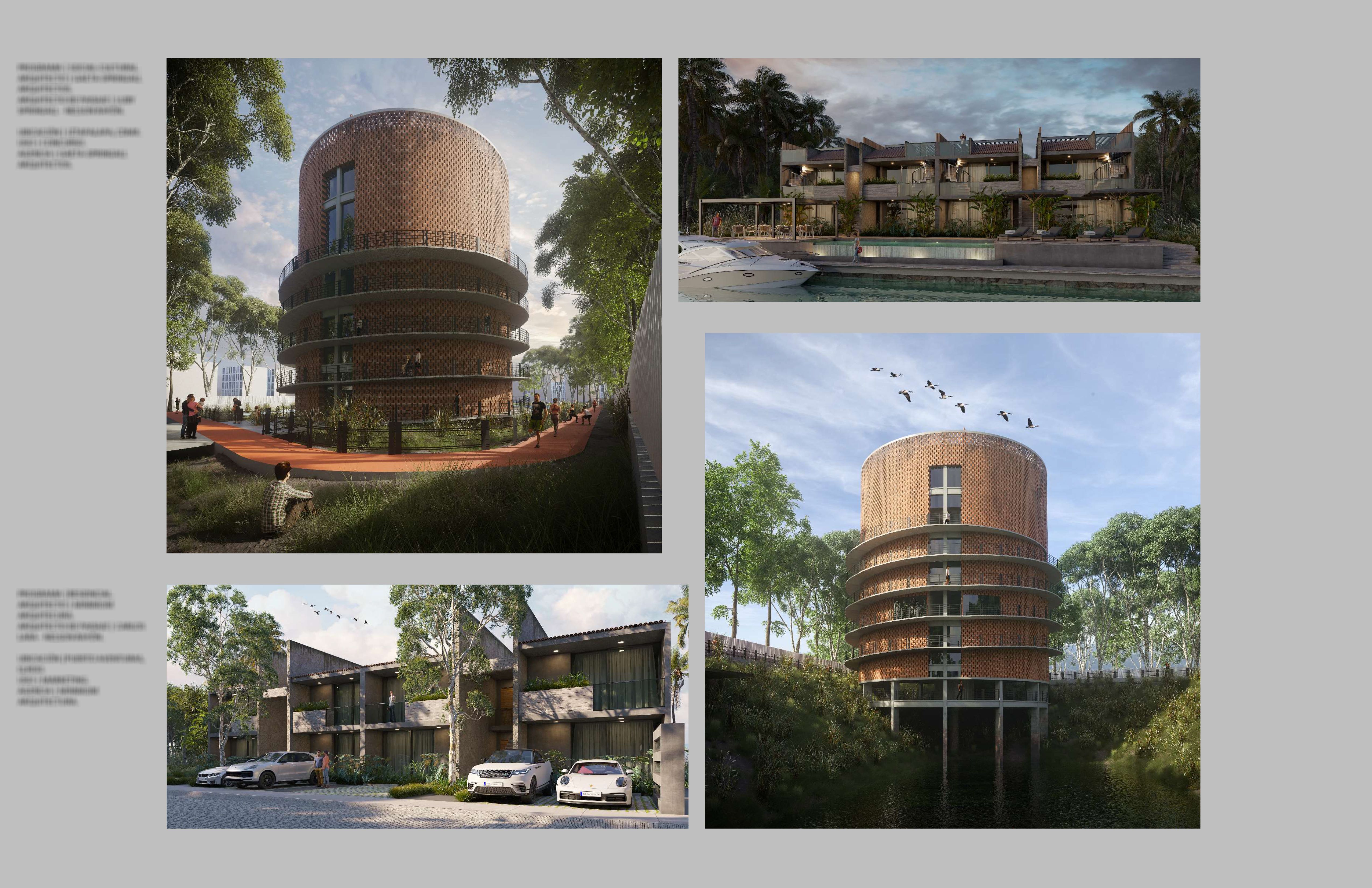
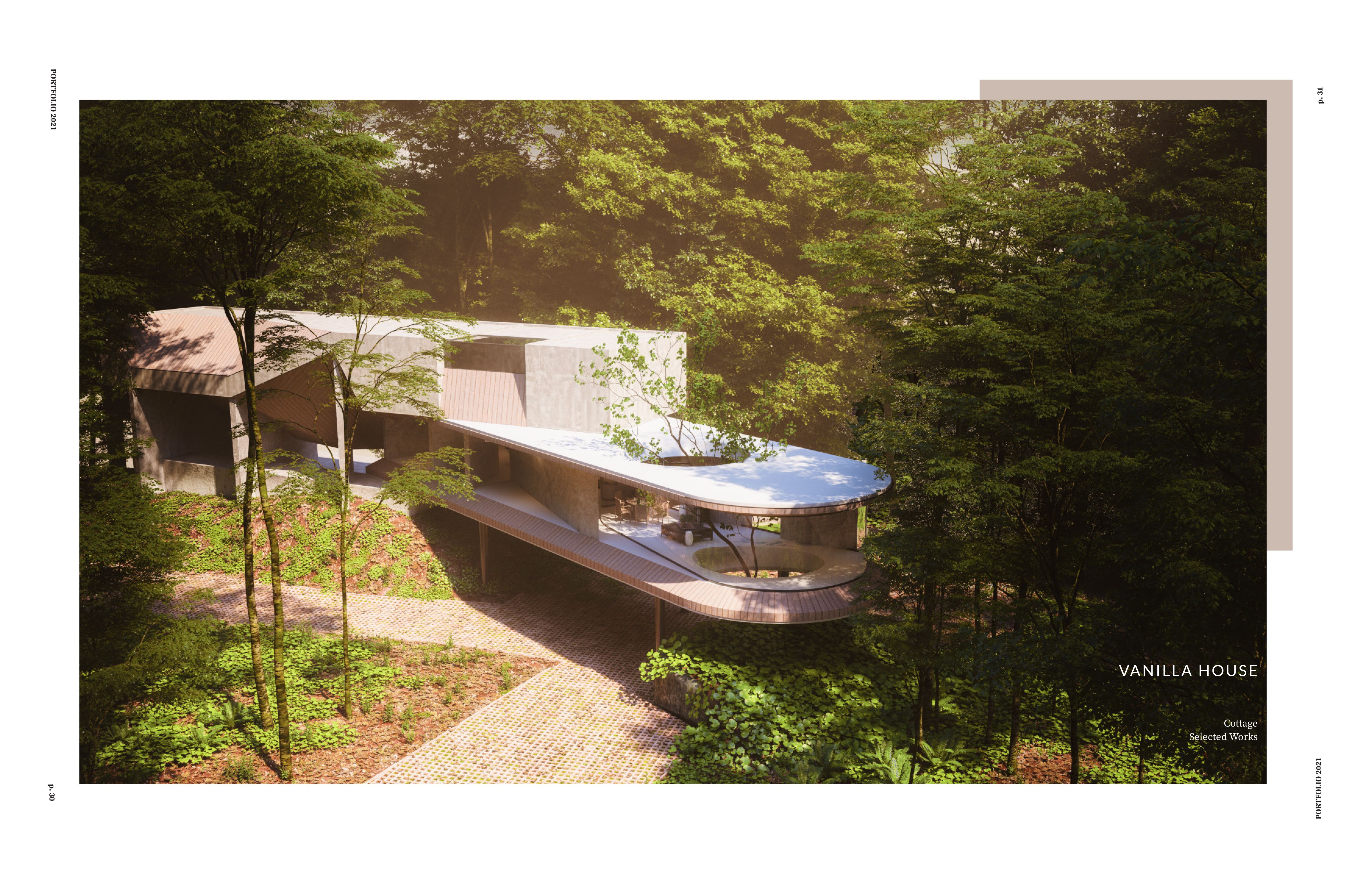
The main idea of the portfolio is to present your most convincing visualizations. And if you have some amazing works, why not give them the attention they deserve? Put each work on a full, separate page. This will allow the viewer to zoom in on all the details plus it makes the portfolio digestible. If your image doesn’t cover the entire page, fill out the remaining parts with a solid white or grayscale color.
Apart from the CV (which will come later in detail), your portfolio doesn’t have to include much text, so arrange these bits cleverly. For example, instead of writing ‘software used: Corona/Vray, Photoshop, etc.’ for each image on every page, display this info at the beginning in a neat paragraph. In our experience, archviz studios are not really interested in knowing how each and every image was created. What is important to include is whether the work was commissioned or not, or if there are only certain parts of the image done by you.
Another great solution to display more text is to create a ‘table of contents’ page at the beginning/end of the portfolio. This gives you enough space to list all your works with software, client name (optional), and what your contribution to the design was (only needed if you didn’t do the image 100% yourself).
A final remark on the text: stick to one or two simple font types throughout the portfolio. Sans serif fonts work well in portfolios, and you could maybe combine them with a serif font for the cover page. You can experiment with different variations of fonts too, like bold or thin.
DON’T
Cast aside the mosaic board presentation style. It does not do any justice to your archviz works as it jams together the visuals, leaving no room to explore them in detail.
Strong graphical elements are not only unnecessary but distract attention from the image presented or the message of the text. We are talking about dots, arrows, random lines, background effects behind the visualization and perhaps the worst: text written across the image. If you clear up your portfolio of these elements, your true expertise - the quality of your visualizations will shine through more.
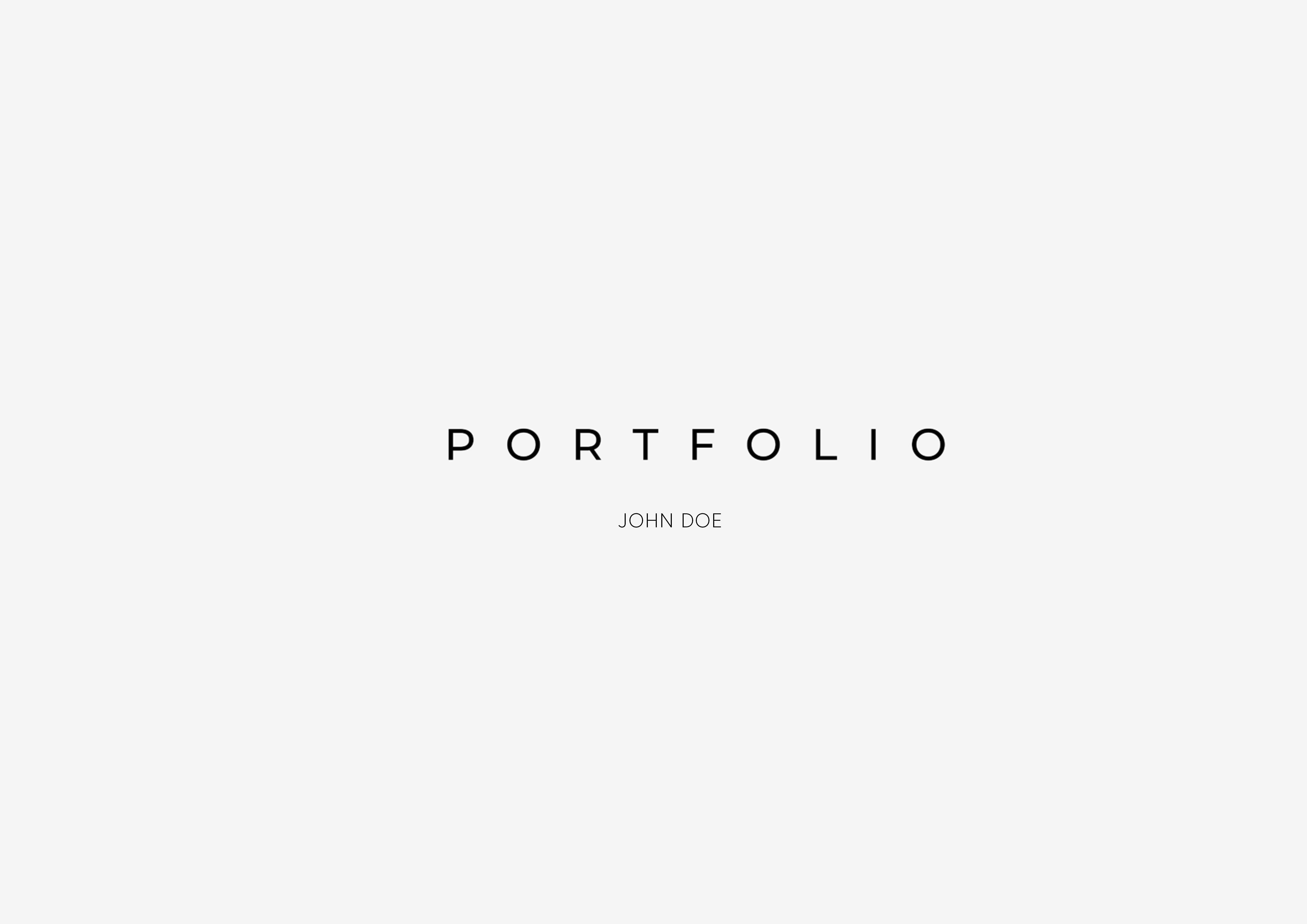
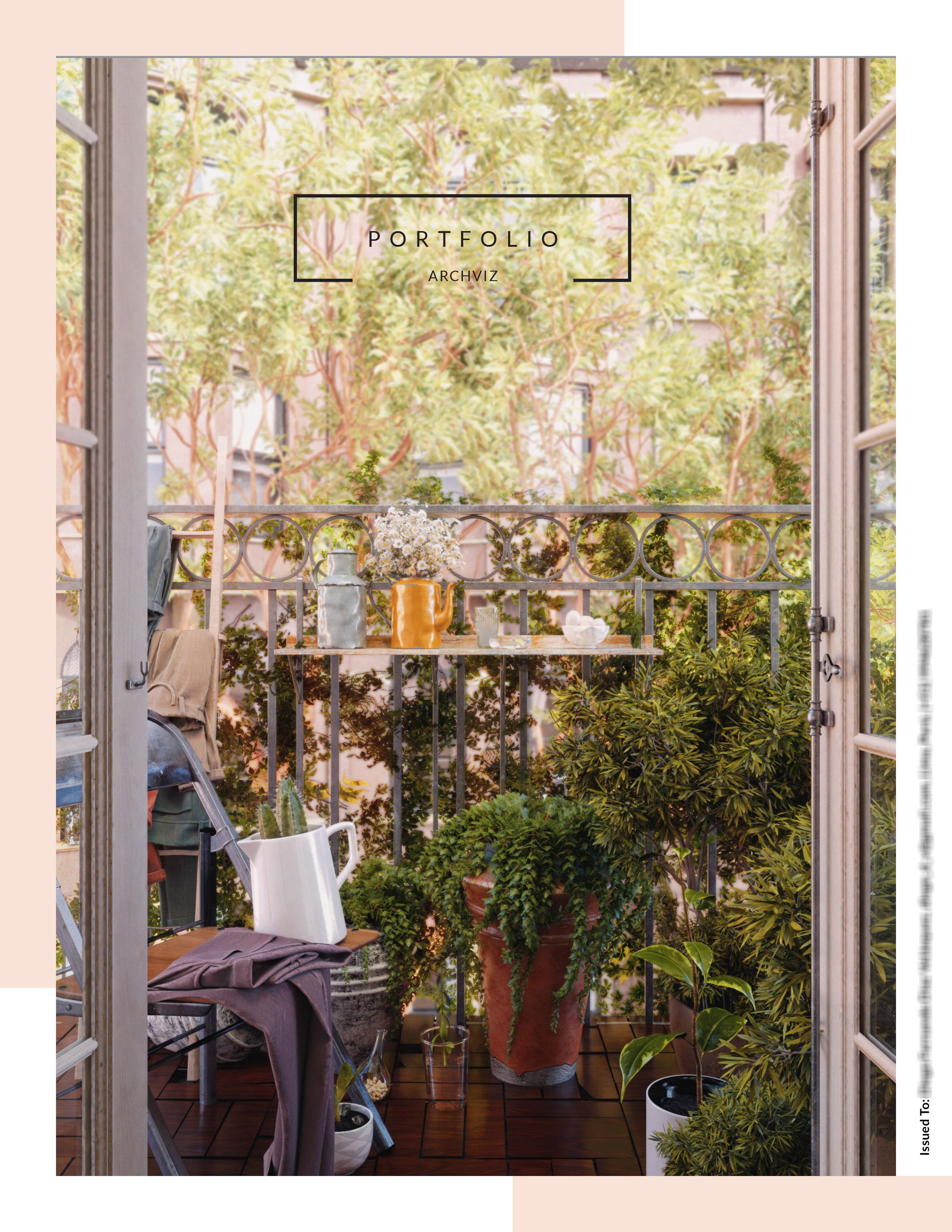
3. Cover
DO
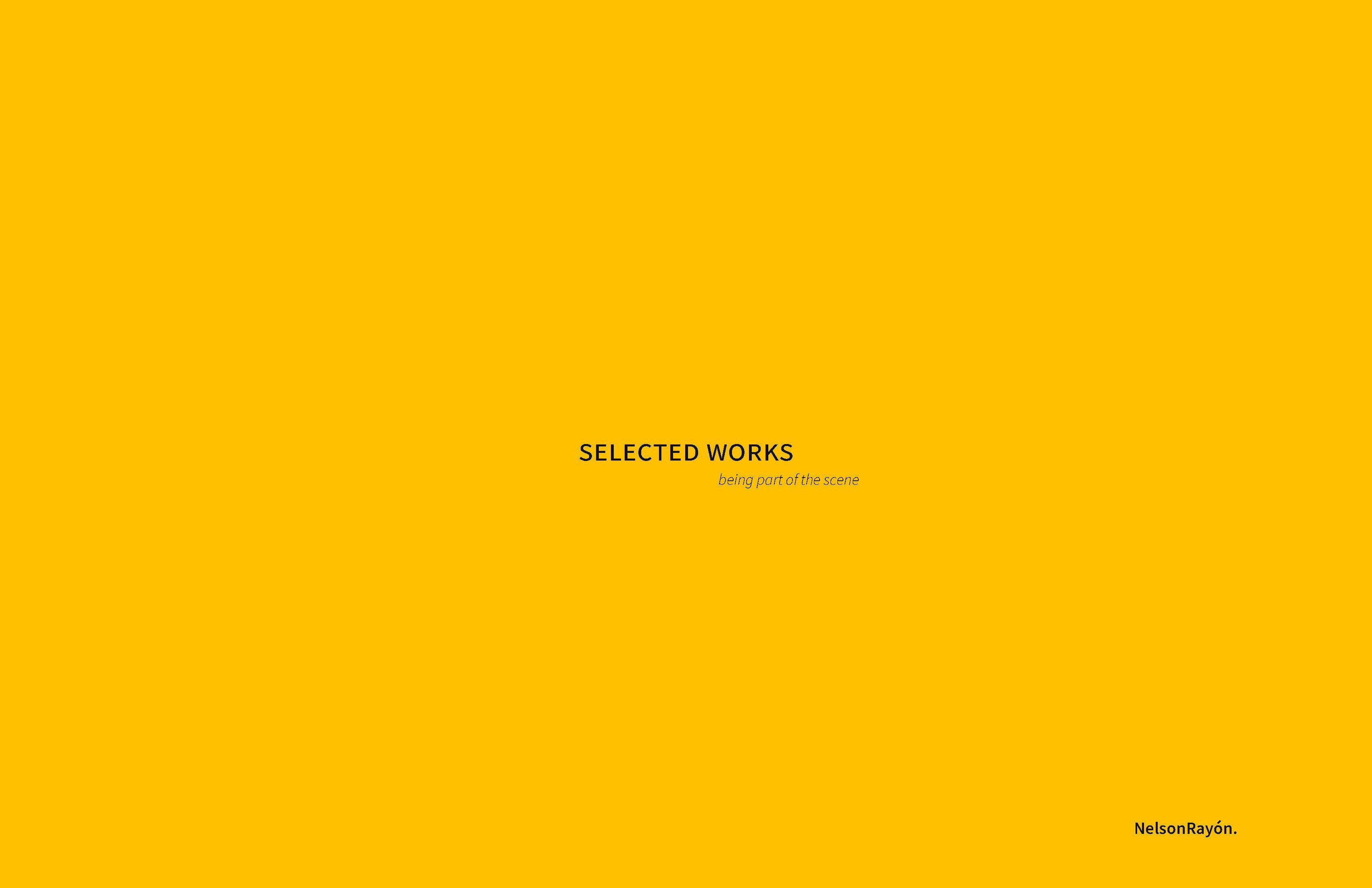
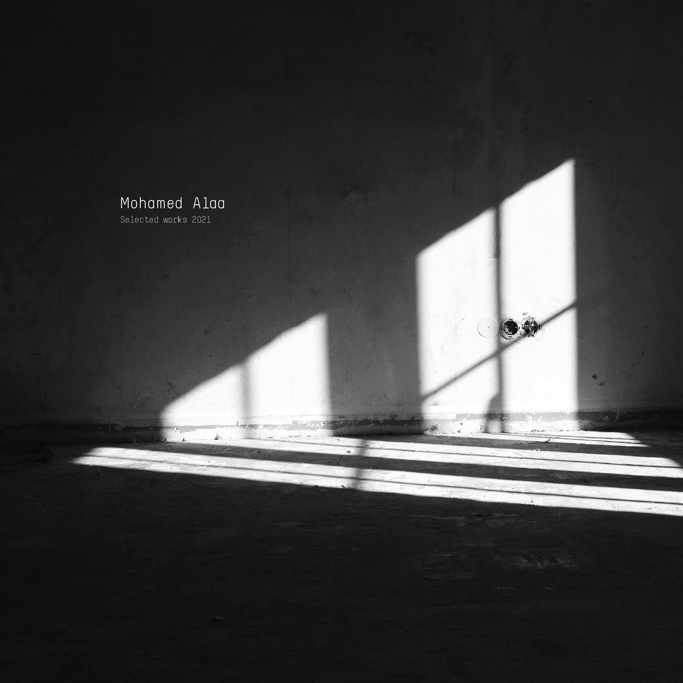
The cover can help you make a great impact on the viewer right at the beginning if done well. Because studios receive tons of portfolios, it would be sensible to add a personal touch to it. You could already communicate here something about yourself. For example, a nice ambient photo taken by you can reflect your interests or support that you have an artistic eye. If you want to keep it simple, that’s okay too - you can put your name with a short text saying ‘Selected Works’ or ‘Portfolio 2022’, or address the company you’re sending your work to. These might seem like minor details but they can make your portfolio a bit different from the rest.
DON'T
Obvious titles like ‘Portfolio’ won’t make a lasting impression. But the worst thing you can do is to leave a different studio name on the cover. If you decide you want to address the firm, don’t forget to update this part and get the name right - check how the firm spells its name.
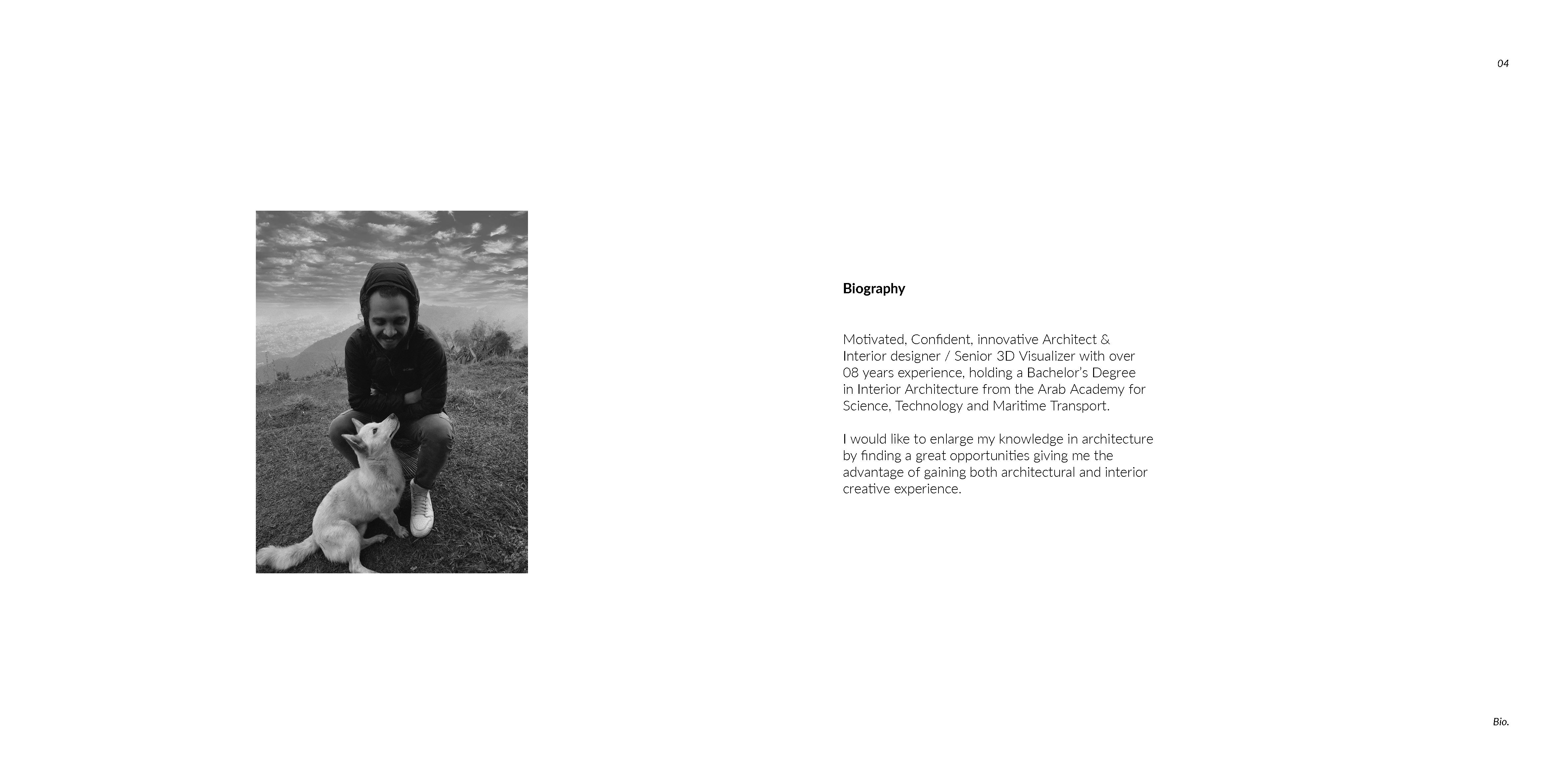
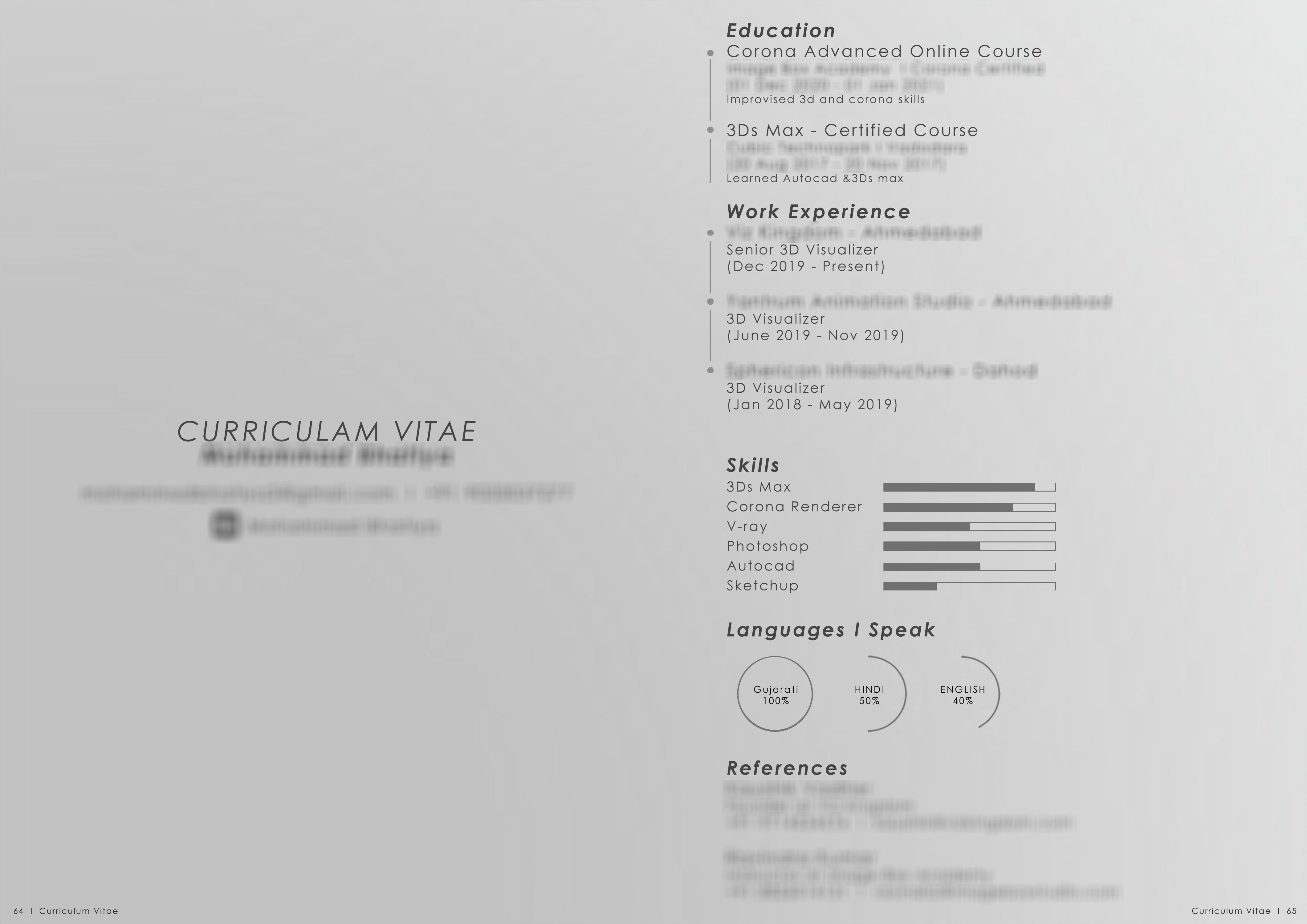
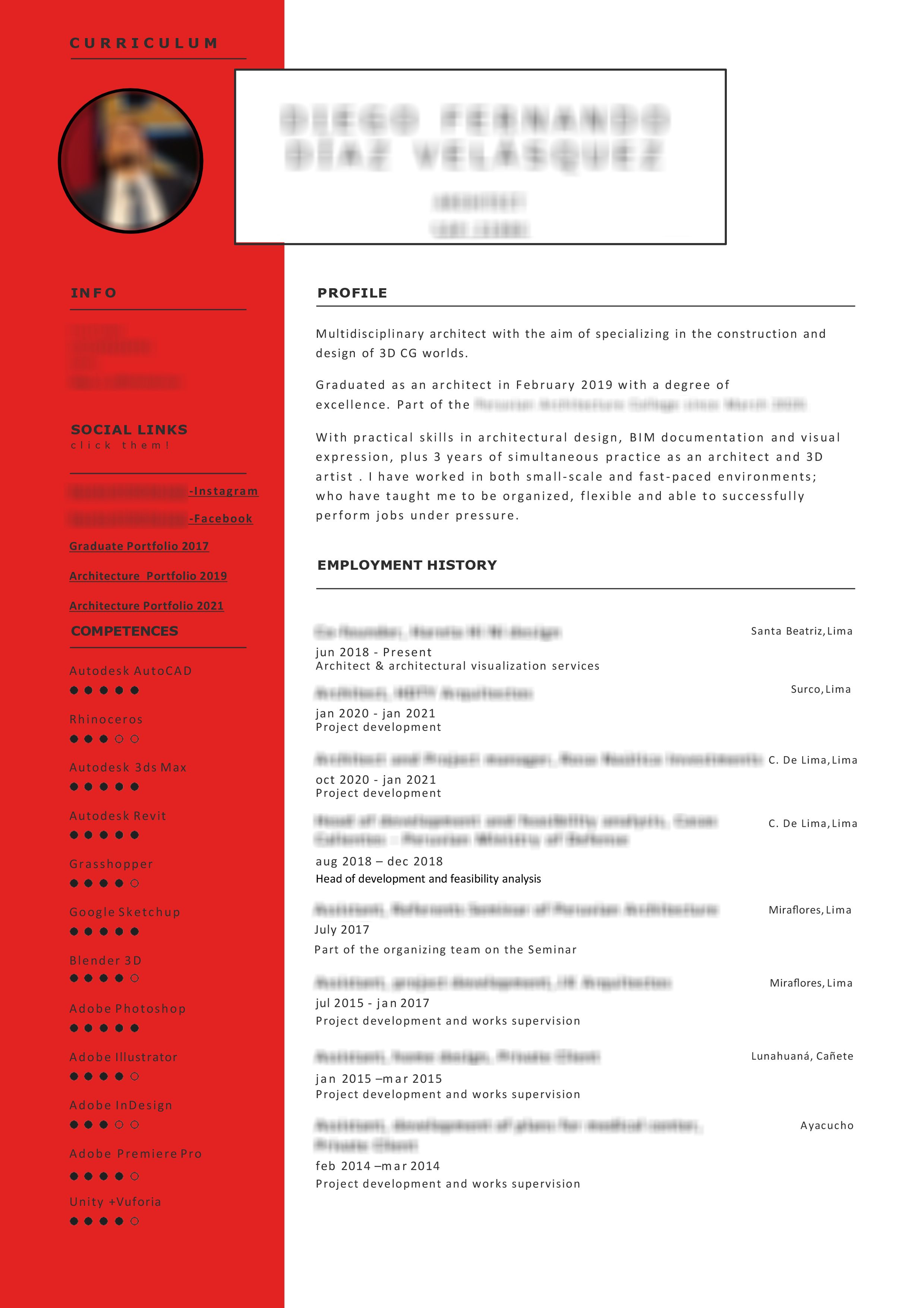
4. CV
DO
Feel free to use a template if you don’t want to design a CV from scratch, as long as it’s simple and well structured. Your CV is where the largest chunk of text comes, so be mindful about what font you use (and keep it consistent in the whole portfolio). Also, space out the text a bit to lead the eye nicely.
About the content, only include information that is true and use meaningful measurements when explaining your skill levels and experience. For instance; ‘I speak and write English fluently’, ‘Conversant in English’ or ‘Five years’ experience working with 3ds Max’. Presenting a language certificate could be a bit misleading too if you haven’t used the language in ages and slipped down a level or two.
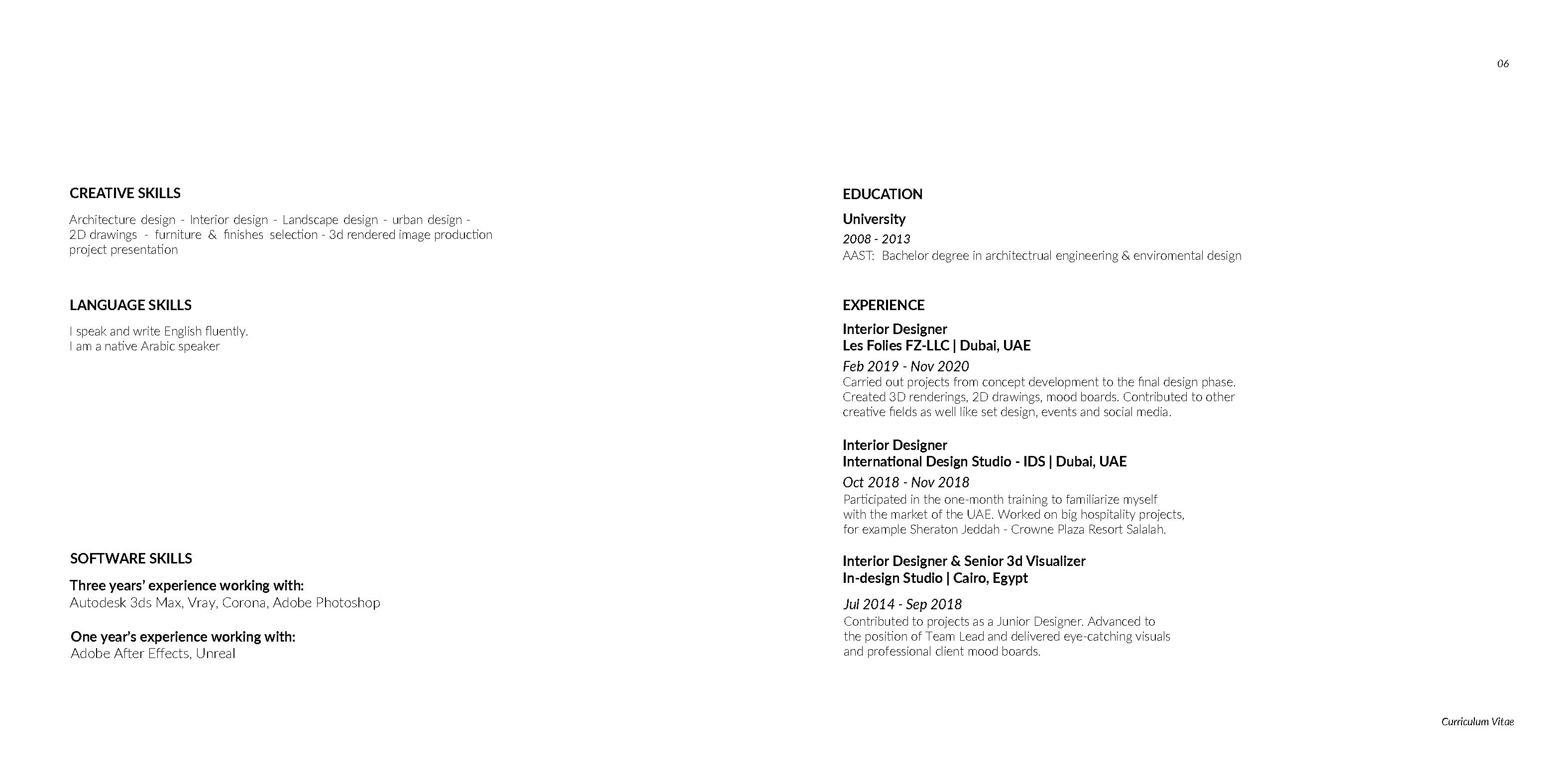
DON’T
Avoid sliders and dots when you want to indicate your skill levels. It doesn’t give the viewer a complete and accurate picture of your competencies. Especially if you don’t provide a minimum and maximum value. How is one supposed to estimate a language or software knowledge this way?
Also, the ‘fake it till you make it’ attitude won’t get you far. Do not state things that are untrue or oversell yourself. If you say you know Vray and Corona and later your employer finds out you are clueless about for example Vray, you will lose the trust that is so necessary to build and maintain at the workplace. It is always easier to admit you have certain limitations and later work on those instead of trying to restore your reputation.
5. Visualizations
DO
Only include those images that you are satisfied with. It is good practice to review the visualizations in your portfolio, especially if you feel you have improved professionally and you could do/show better. Taking older images and doing rework on them is also an option - once you’re done you can just swap the images without having to re-edit the layout/texts.
DON’T
Forcing outdated images in your portfolio just to have more to show is impractical. Speaking for ourselves, we’d rather see a smaller selection of powerful images than a greater selection including poor ones too. It is also confusing to see when artists include a weak image in between two good ones. It makes us wonder - doesn’t s/he see that these images are not of the same quality? Be more selective to avoid situations and judgments as such.
6. End page
DO
The end page again provides a space to leave your mark and include something personal about yourself. A well-selected quote by your favorite architect/artist/entrepreneur can speak volumes about your views, showing you know who’s who in the profession at the same time. You can include your ars poetica too which reflects your philosophy, or if these are far from you, include your contact information to be practical.

DON’T
It is customary to thank viewers for their attention and time for dedicating time to you. However, in your portfolio, the typical ‘thank you!’ note carries the impression that you don’t know how to end your presentation. It might seem a bit sloppy or unimaginative which defeats the purpose of a creative portfolio. Sign off with a snappy ending, use this line to make the viewer want to get to know you more.

7. Portfolio transformation example
András had mentioned most of the tips during a D2 Conferences online event too. One of the students taking our Image Generalist in archviz course, Silvia Duran, told us that she had completely redesigned her portfolio based on these tips before applying to the course. Take a look at the portfolio transformation below:

Hope you find these tips useful too when creating/perfecting your portfolio!
Do you wish to get personalized feedback on your work and career advice?
Apply to our Portfolio & Career Consultancy session!
Special thanks to the following artists who gave us permission to use their portfolios: Mohamed Alaa, Nelson Rayon, Mohammad Bhatiza, Diego Díaz Velásquez, Silvia Duran


